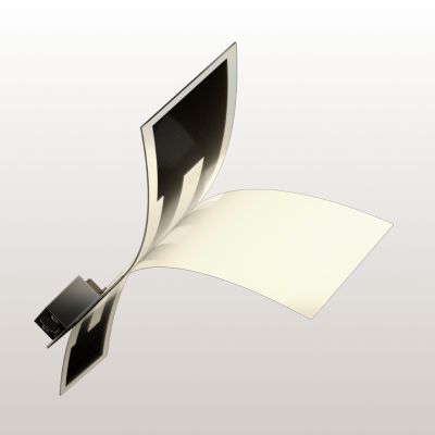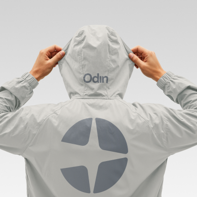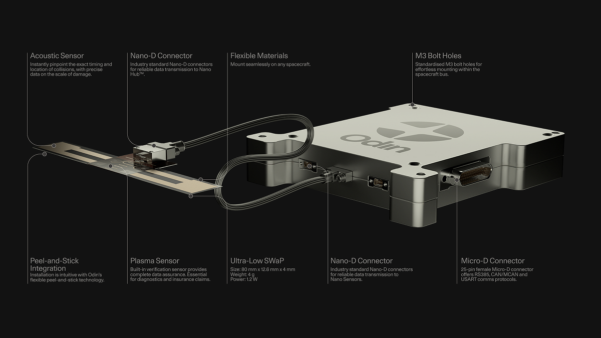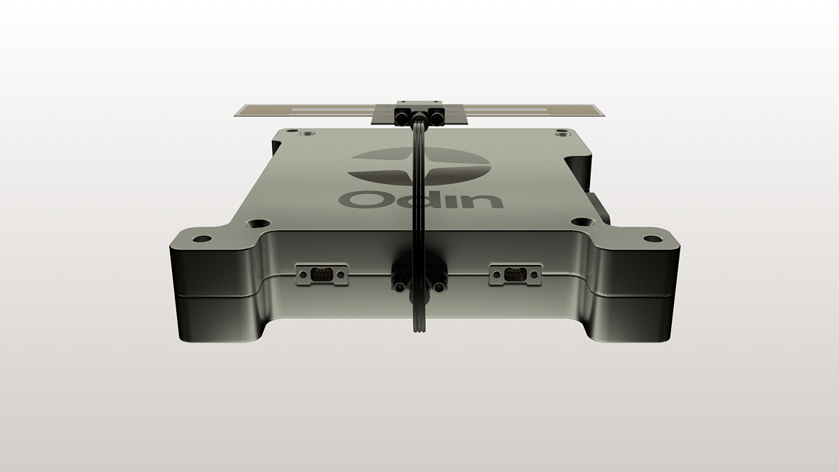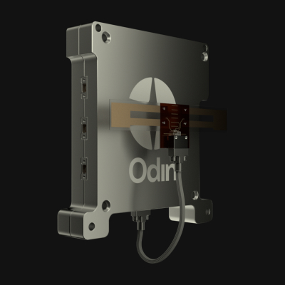


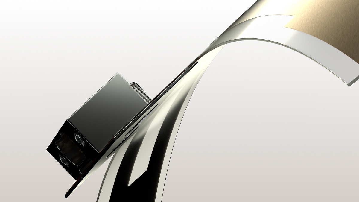

Precision. Clarity. Confidence. The new logo distills Odin's mission into a single mark: four converging vectors that evoke both orbital debris and the moment of detection. Simple, instantly recognizable. The website is built around a recurring visual motif. As users scroll, an animated 3D render of the Odin sensor appears between each section, orbiting in and out of view. It's a deliberate echo of the technology: always watching, always in position, reassuringly constant against the chaos of space debris. Multi-angle renders throughout the site transform a compact piece of hardware into something commanding. The sensor earns attention not through embellishment, but through restraint. The pitch deck carries the new identity into investor conversations, built on the same visual language and messaging framework.