

We built the brand around the company’s central commercial idea:
The future of nuclear has to be cheaper.
The messaging starts with the cost of electricity and works backward into the architecture that makes it possible. The reactor is the technical breakthrough. The customer-facing promise is compact, reliable power without the cost burden of conventional generation.
That distinction shaped the entire website. Nuclear Turbines could not feel like a utility, a turbine manufacturer, or another company selling the distant promise of an advanced reactor. It needed to communicate a complete power plant, designed around where electricity demand and cost are becoming constraints.
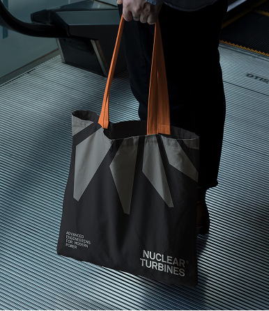
We evolved the existing turbine symbol into a more ownable identity.
The new mark is constructed from a sequence of expanding blades, creating a sense of rotation, airflow, and mechanical progression. It retains a direct connection to the turbine while moving away from the circular marks and atom symbols that dominate the nuclear and deep-tech categories.
The compact symbol is paired with a narrow, stacked wordmark that gives the identity an industrial presence without making it feel heavy or dated. The system can operate as a full combination mark, an independent symbol, or a standalone wordmark across the website, documents, presentations, and launch materials.
The technology itself became the foundation of the imagery.
Working from the company’s engineering models, we created a detailed 3D representation of the integrated reactor and turbine system. Transparent materials expose the architecture beneath the surface. Metallic components give the machine physical weight. Colored airflow moves through the assembly, allowing visitors to understand what happens inside a system that does not yet exist at commercial scale.
The renders show the full machine from multiple angles, isolate the reactor and turbine components, and move into close details of the compressor, blades, pipework, and heat path. The same language extends into motion through rotation, directional flow, transparency, and mechanical assembly.
Rather than using generic atoms, cooling towers, or abstract energy graphics, the brand shows the actual idea.
The website turns a complicated engineering system into a clear sequence.
.png)
%20(1).png)
.png)
%20(1).png)
.png)