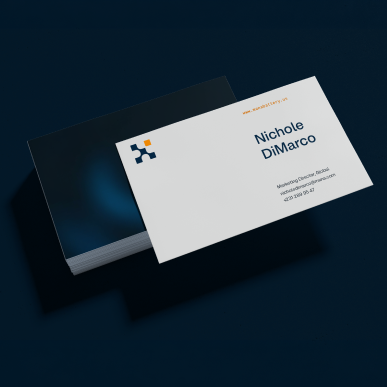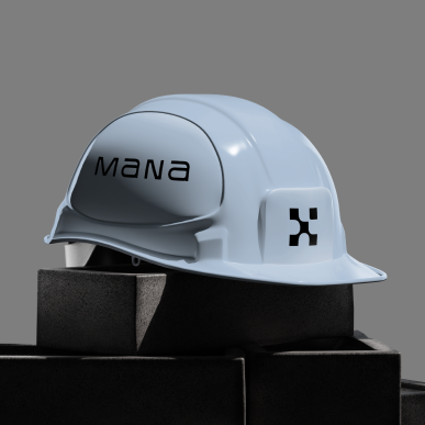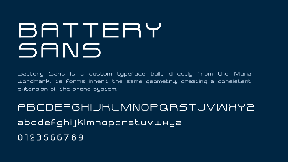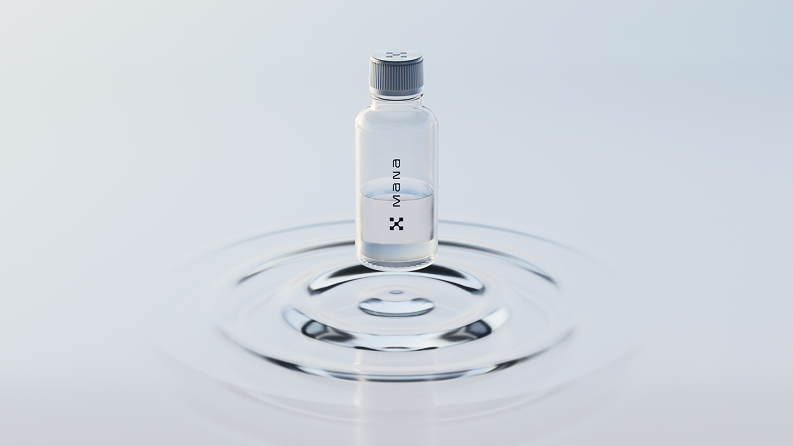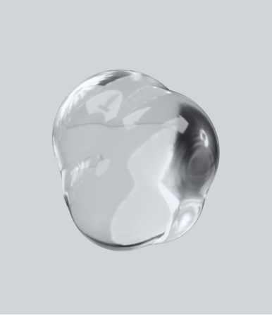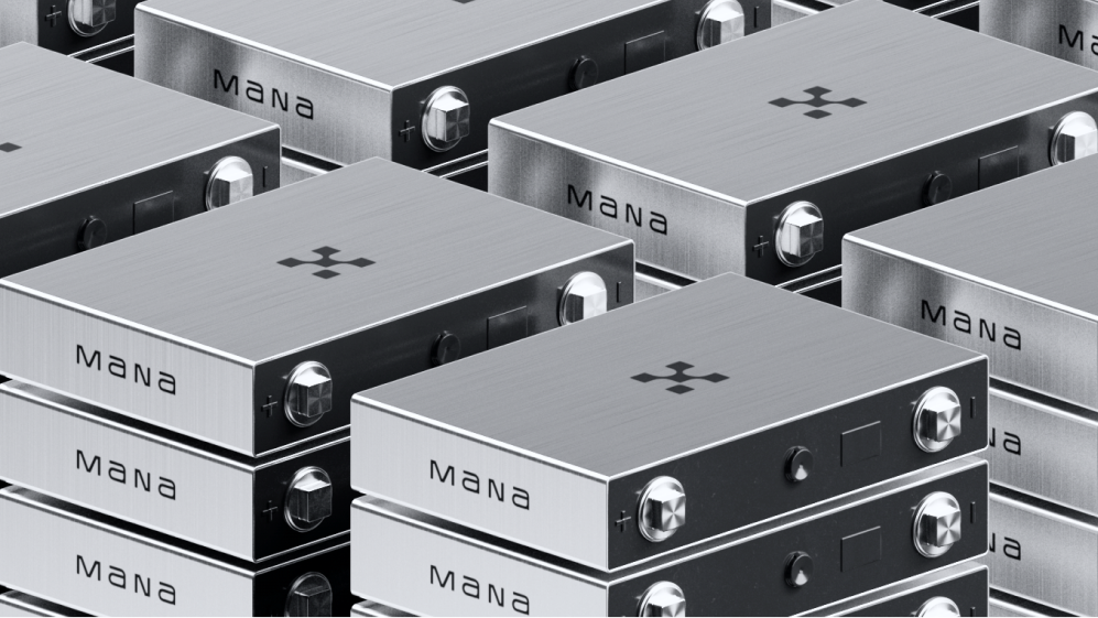

The logo, wordmark, and visual system all came from the science inside the battery.
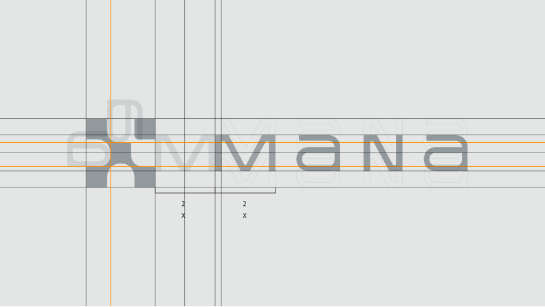
The mark simplifies the movement of sodium ions into a graphic form. It gives Mana a symbol rooted in the technology, not the usual energy clichés.
The wordmark builds on the same idea. “Na” already sits inside the name, so we used it as part of the identity and let the chemistry show up naturally.
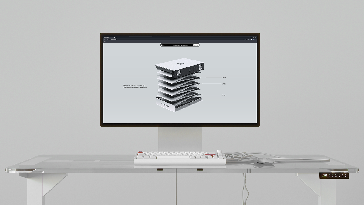
Across the site, motion, renders, diagrams, and brand elements, the goal was to make Mana feel grounded in the present and ready for the future.