

We built the new brand around the idea at the center of Hermeus:
Building fast planes, fast.
That meant communicating two kinds of speed at once. The speed of the aircraft and the speed of the company creating them.
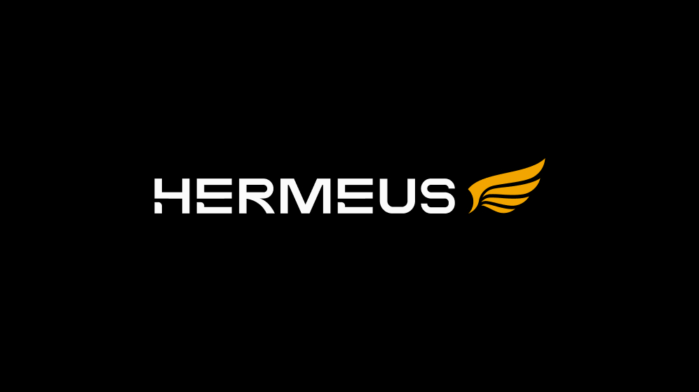
We began by redrawing the Hermeus wing.
The original mark had established recognition, and its four feathers represented the company’s four founders. We retained that equity while rebuilding the logo with sharper geometry, cleaner proportions and a stronger sense of forward motion.
A new wordmark and typography system gave the identity greater precision and maturity. The visual language became more controlled, technical and authoritative, reflecting Hermeus’ growth into its next phase without falling into the familiar clichés of defense and aerospace branding.
The aircraft became the center of the system.
We created a new library of detailed 3D renders that presented the planes as real, engineered machines. Materials, propulsion systems, structural details and changing configurations showed both the physical product and the constant evolution behind it.
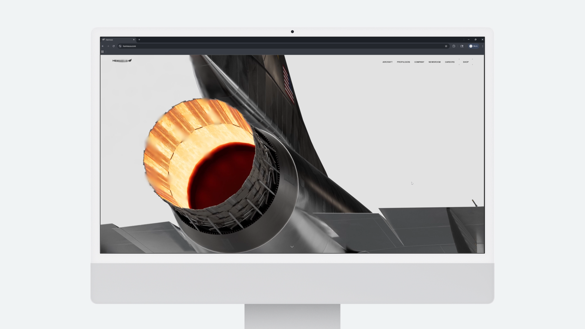
Motion brought the forces of high-Mach flight into the brand. Heat animation, engine distortion, vibration, motion blur and transitions from obscurity into focus made speed feel physical.
The same principle shaped the website.
Rather than presenting the aircraft as isolated products, we showed them as part of a continuous development process. Each Quarterhorse vehicle tests a new capability, produces new information and accelerates the next aircraft.
Interactive diagrams and technical animations explain the systems behind the planes. The newsroom documents contracts, flights and development milestones. Careers and company content reveal the culture and people responsible for moving the program forward.
Every part of the experience reinforces the same idea: Hermeus moves quickly because it builds, tests and learns in the real world.



.jpg)