


We framed Navier as the next inflection point in a long arc: drafters enabled design at scale, CAD brought speed and precision, simulation added data and insight, and now autonomous agents take the next leap. That narrative anchors both the site and the ongoing PR campaign.
Navier's founders asked for something specific: the spirit of IBM in its golden age. Straightforward language. No flourish. Copy that speaks to engineers plainly, but with enough technical depth to prove Navier understands the frustrations they live with daily. This is a platform built by engineers who wanted something better. The tone reflects that.
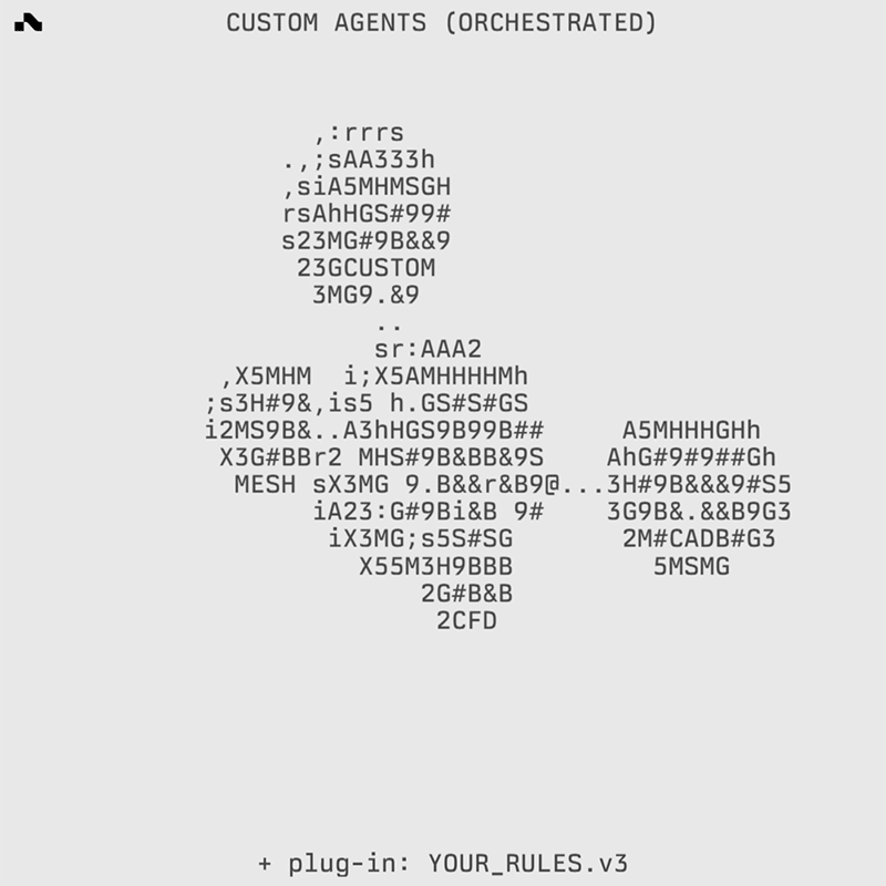
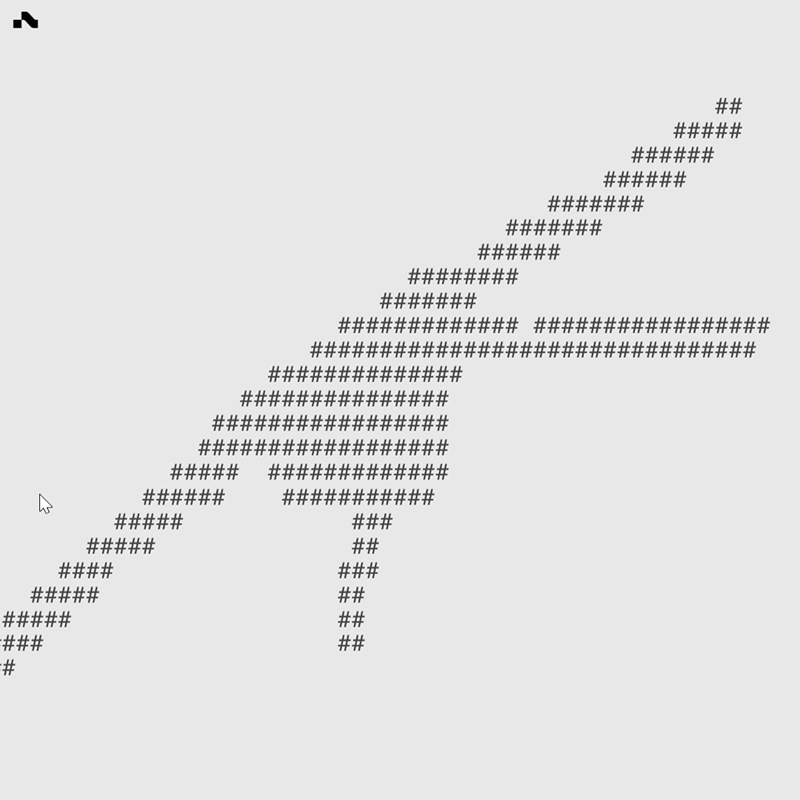
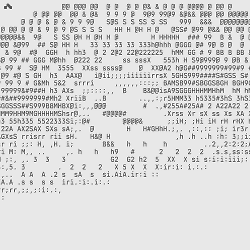
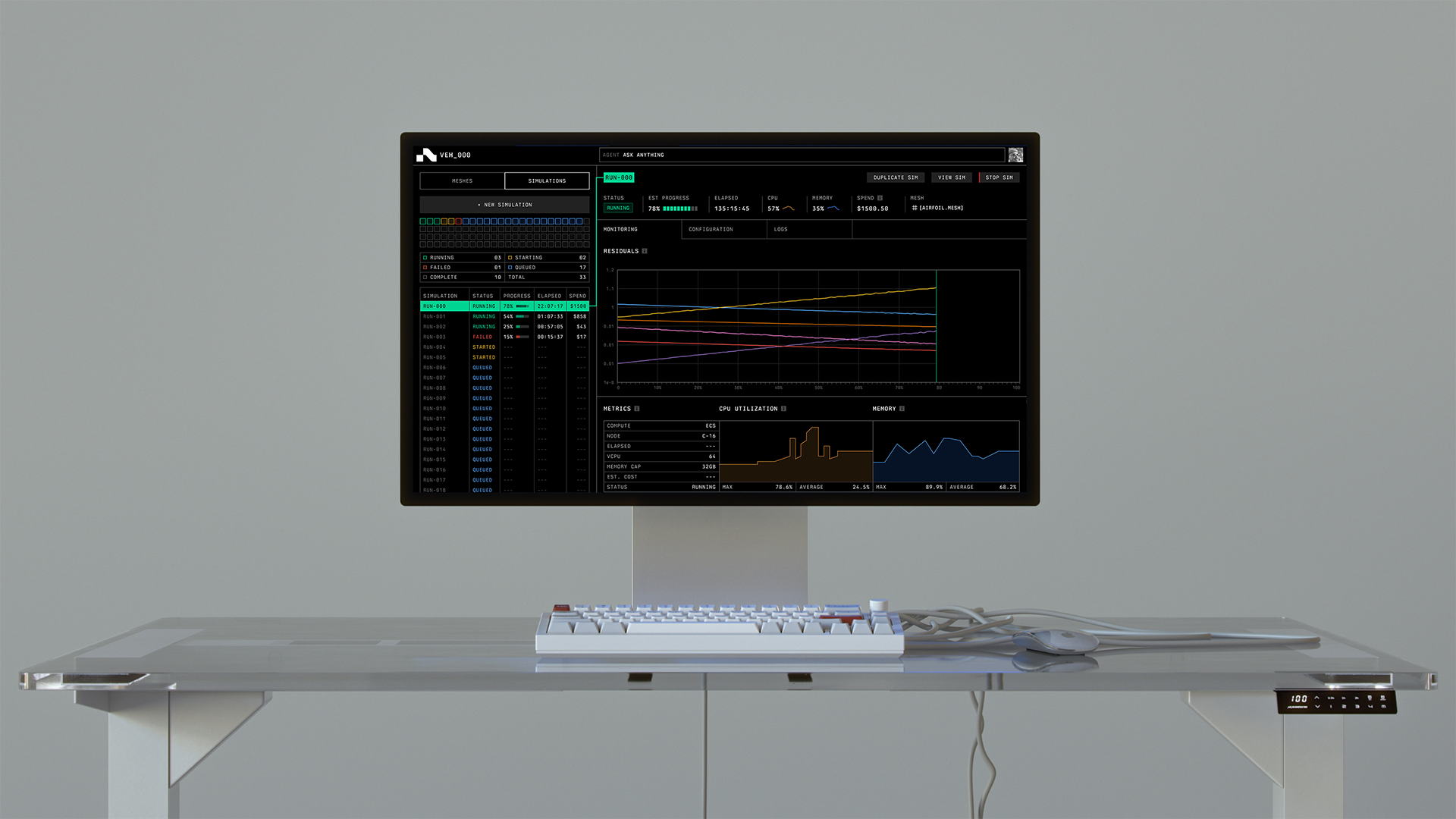
The homepage opens with a custom vortex animation. Thousands of datapoints swirl around the user's cursor, mimicking airflow, shifting color and magnitude with the speed of movement. Custom ASCII animations nod to engineering's computational roots. From there, the site leans heavily on visuals: product screenshots, animated walkthroughs, the interface in motion. The design lets Navier's work speak without requiring explanation.
The PR campaign runs parallel, reinforcing the same narrative: a productivity shift on the scale of what came before.